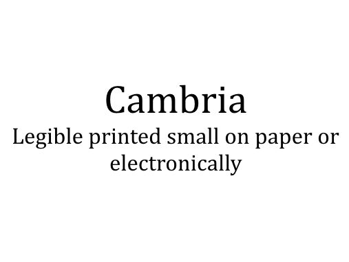
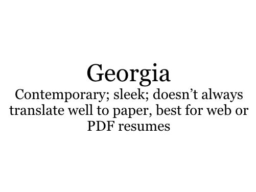
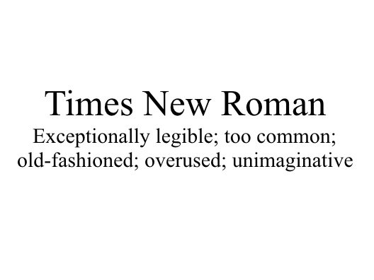
You spend hours creating your resume. You make sure the dates are correct; the spelling and grammar are spot on; and you’ve checked that all your verbs are parallel in structure. But did you use the most legible font? Does it demonstrate your professionalism while maintaining character?
There are hundreds of thousands of fonts. Some are installed on your computer, others are available for purchase. Some fonts look great for children’s books or comic books, some for printed newspapers, while others are best suited for electronic documents such as whitepapers or eBooks.
But which ones are the best for your professional resume?
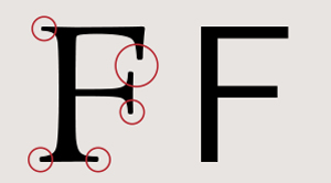
First, a lesson about serifs.
In the example to the right, you’ll notice circled embellishments. Those embellishments make a font a serif typeface. They are not just decorative; they have been credited (and disputed) for increasing readability as well as reading speed because they help the eye travel across a line. But what it really boils down to is preference AND legibility, particularly when you embellish it with italics, bolding, or varying sizes.
Because size does matter, keep the text on your resume between a 10.5 and 12 point font. Anything less than 10.5 will be too difficult for the reader to decipher. Anything larger than 12 makes it look like your resume doesn’t have much to it and you’re trying to fill space.
Consider these serif and sans-serif typefaces that produce the best results for resumes:
Sans Serif Typefaces
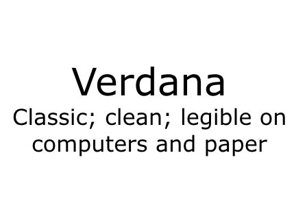
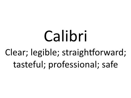
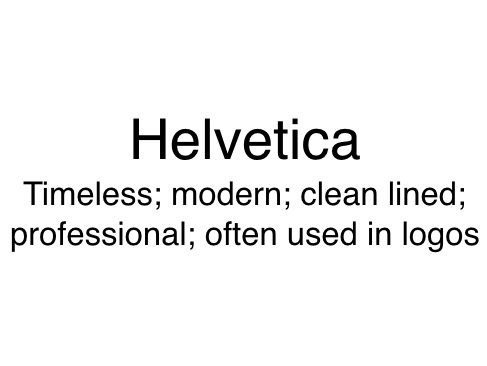
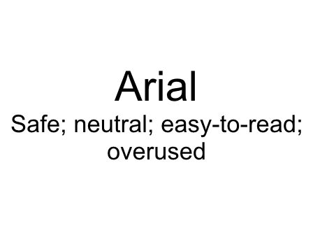
Serif Typefaces
